
VaSSTra Tutorial: Variables, States, Sequences, Trajectories
Source:vignettes/vasstra-tutorial.Rmd
vasstra-tutorial.RmdLongitudinal engagement data have a structural problem: eight indicators per student per course are too many dimensions to compare students on, and averaging them across time destroys exactly the thing that matters: how each student changes. The VaSSTra method solves this in three compressions. Multivariate observations become a small set of interpretable states; each student’s states, ordered in time, become a sequence; and students whose sequences resemble each other become trajectories, a person-centered summary of change that a single regression coefficient cannot express.
This tutorial runs the complete workflow on the longitudinal engagement data from the VaSSTra chapter of Learning Analytics Methods and Tutorials, in this order:
- The complete analysis in one call.
- Choosing and defending the number of states.
- Understanding what the states are.
- Sequences: how states unfold over time.
- Trajectories: groups of similar journeys.
- Describing what the trajectories mean.
- Relabeling without refitting.
- Full control: explicit steps and grid comparisons.
| Task | Verb |
|---|---|
| Complete analysis | vasstra() |
| Compare cluster counts |
evaluate(), plot()
|
| Fit statistics | fit_indices() |
| Rename groups | set_labels() |
| Tidy results |
as.data.frame(), summary()
|
| Individual steps |
step1_states() … step4_describe()
|
| Explicit grids |
state_choices(), trajectory_choices()
|
1. The complete analysis in one call
The engagement data ship analysis-ready: 142 students at
eight course positions, with eight course-standardized indicators and
attached role metadata, so no column plumbing is needed. The chapter’s
substantive decision (three latent profiles named Disengaged, Average,
and Active) is expressed entirely by the labels: three labels mean three
states, estimated by latent profile analysis (mclust "EEI",
the chapter’s tidyLPA Model 1) because that is the default state method.
The LCS distance with Ward clustering follows the chapter’s trajectory
analysis.
library(VaSSTra)
data("engagement", package = "VaSSTra")

fit <- vasstra(
  engagement,
  state_labels = c("Disengaged", "Average", "Active"),
  state_colors = c(Disengaged = "#e01a4f", Average = "#FFDF3C", Active = "#28a41f"),
  dissimilarity = "lcs",
  cluster_method = "ward.D2",
  positive_states = "Active",
  negative_states = "Disengaged"
)
#> Using n_states = 3 to match the supplied labels.
#> Registered S3 method overwritten by 'Nestimate':
#>   method     from
#>   print.mcml cograph
#> Selected n_trajectories = 3 (lcs + ward.D2, silhouette = 0.514); see `diagnostics$selection`.
fit
#> VaSSTra Analysis
#>   142 subjects | 8 times | 3 states | 3 trajectories
#>   lcs + ward.D2 | silhouette 0.514
state_colors pins the state palette on the fit, so every
plot below is drawn on the chapter’s colours. A companion argument,
state_order, fixes the order states read in every plot;
here the discovery order is already low-to-high, so it is left at its
default. Both are optional.
The one remaining automated decision, the number of trajectories, is
reported in the message and stored with its full comparison table in the
fit, so it can be defended later rather than taken on faith. Leaving the
labels out too (vasstra(engagement)) automates the state
count as well; automation never selects a solution whose smallest group
holds under five percent of observations, the conventional threshold
below which latent classes are treated as spurious.
2. Choosing and defending the number of states
A fitted clustering is a claim, and the claim needs two kinds of
evidence: that the chosen count beats its neighbors, and that the chosen
solution is internally sound. evaluate() provides both in
one object: a candidate table across counts and a per-group quality
table for the fitted solution.
evaluation <- evaluate(fit)
evaluation
#> VaSSTra clustering evaluation: states (lpa)
#>   Fitted: 3 states | silhouette 0.260
#>   Candidates:
#>  n_states method lpa_model silhouette      bic      aic classification_entropy
#>         2    lpa       EEI      0.351 21679.00 21553.12                  0.903
#>         3    lpa       EEI      0.260 20120.13 19948.93                  0.894
#>         4    lpa       EEI      0.203 19362.24 19145.73                  0.893
#>         5    lpa       EEI      0.197 19008.96 18747.13                  0.871
#>         6    lpa       EEI      0.181 18600.79 18293.64                  0.887
#>  min_size max_size size_ratio eligible  best fitted
#>       509      627      1.232     TRUE FALSE  FALSE
#>       266      551      2.071     TRUE FALSE   TRUE
#>       152      414      2.724     TRUE FALSE  FALSE
#>       155      367      2.368     TRUE  TRUE  FALSE
#>        33      350     10.606    FALSE FALSE  FALSE
#>   Fitted states:
#>       state   n proportion silhouette
#>  Disengaged 266      0.234      0.325
#>     Average 551      0.485      0.229
#>      Active 319      0.281      0.261
#>
#> VaSSTra clustering evaluation: trajectories (lcs + ward.D2)
#>   Fitted: 3 trajectories | silhouette 0.514
#>   Candidates:
#>  n_trajectories dissimilarity  method silhouette mean_within_distance min_size
#>               2           lcs ward.D2      0.440                6.353       41
#>               3           lcs ward.D2      0.514                4.541       28
#>               4           lcs ward.D2      0.400                4.172       28
#>               5           lcs ward.D2      0.370                3.918        8
#>               6           lcs ward.D2      0.350                3.595        8
#>  max_size size_ratio eligible  best fitted
#>       101      2.463     TRUE FALSE  FALSE
#>        73      2.607     TRUE  TRUE   TRUE
#>        43      1.536     TRUE FALSE  FALSE
#>        43      5.375     TRUE FALSE  FALSE
#>        43      5.375     TRUE FALSE  FALSE
#>   Fitted trajectories:
#>    trajectory  n proportion mean_within_distance silhouette
#>  Trajectory 1 41      0.289                4.259      0.581
#>  Trajectory 2 73      0.514                4.961      0.440
#>  Trajectory 3 28      0.197                3.857      0.609
plot(evaluation)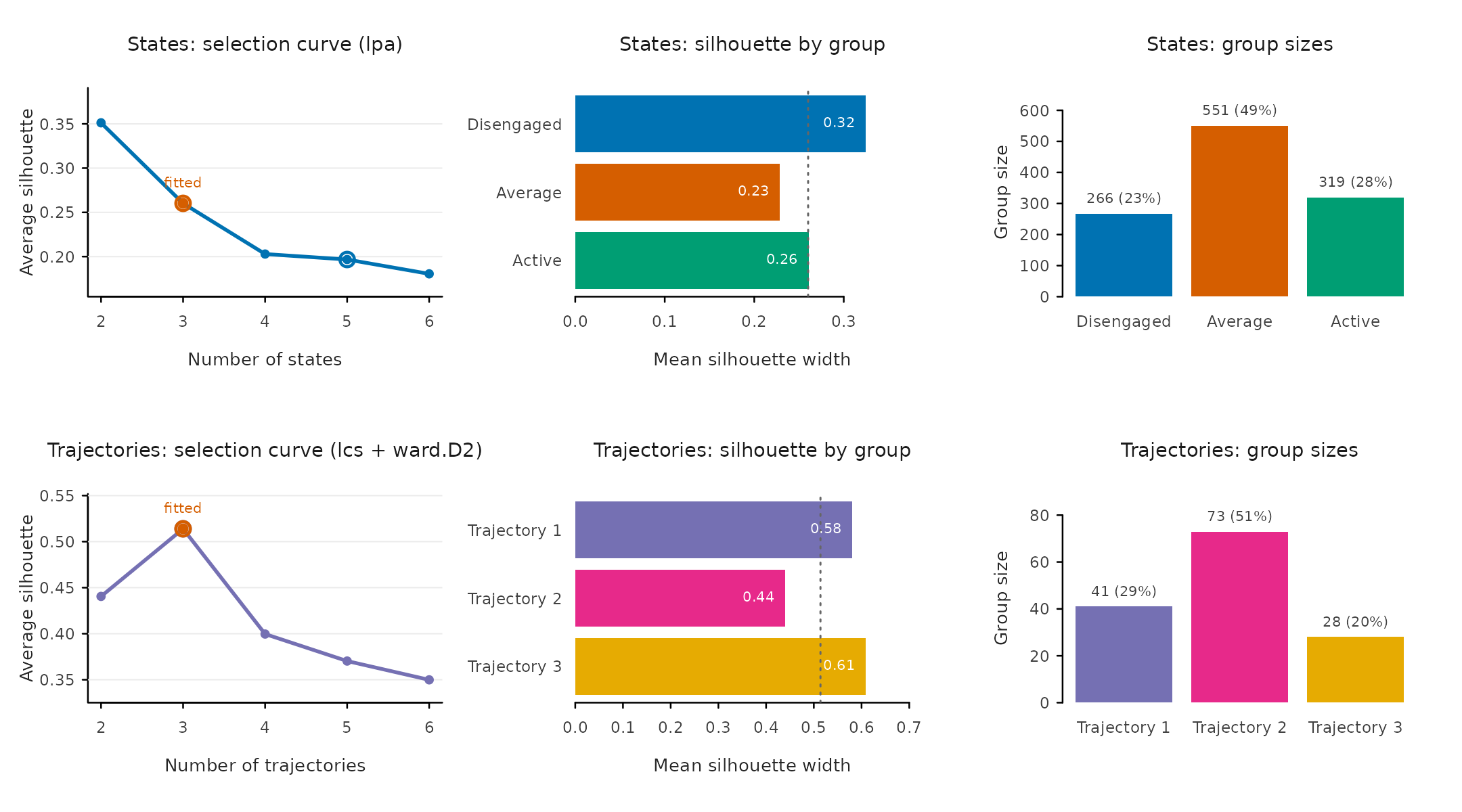
The two rows of panels answer different questions. The trajectory selection curve peaks at the fitted three groups (silhouette 0.51 against 0.44 and 0.40 for two and four), so the automated choice is also the local optimum, the strongest position a selection can be in. The state curve instead declines from two: with LPA the count was fixed by the three labels, and the panel makes the cost of that substantive choice visible (0.26 at three against 0.35 at two) instead of hiding it. The silhouette-by-group bars then locate where cohesion comes from: the two flanking groups are the most compact (0.58 and 0.61), while the large middle trajectory (0.44) is the first place to look when judging whether three groups over-merge distinct journeys.
For the model-based evidence reviewers expect,
fit_indices() returns the complete information-criterion
family as one tidy row: the same content as tidyLPA’s fit table, plus
the classification-quality columns that usually have to be assembled by
hand.
fit_indices(fit)
#> VaSSTra fit indices: states (lpa)
#>  n_states method lpa_model log_likelihood n_parameters      aic      bic
#>         3    lpa       EEI       -9940.47           34 19948.93 20120.13
#>     sabic     caic      awe      clc      kic      icl entropy prob_min
#>  20012.14 20154.13 20461.33 20144.89 19985.93 20384.09   0.894    0.945
#>  prob_max silhouette min_size max_size size_ratio
#>     0.956       0.26      266      551       2.07
Three of these numbers carry the interpretation. Entropy (0.89) says
the posterior classification is sharp overall. prob_min
(0.94) says even the worst class assigns its members with high
confidence. Entropy summarizes the whole matrix and
prob_min guards its weakest class, so reporting both
prevents a good average from hiding a bad class. The criterion family
(AIC through ICL) is there for the comparison table:
fit_indices(fit, compare = TRUE)
#> VaSSTra fit indices: states (lpa)
#>  n_states method lpa_model log_likelihood n_parameters      aic      bic
#>         2    lpa       EEI      -10751.56           25 21553.12 21679.00
#>         3    lpa       EEI       -9940.47           34 19948.93 20120.13
#>         4    lpa       EEI       -9529.86           43 19145.73 19362.25
#>         5    lpa       EEI       -9321.57           52 18747.13 19008.96
#>         6    lpa       EEI       -9085.82           61 18293.64 18600.79
#>     sabic     caic      awe      clc      kic      icl entropy prob_min
#>  21599.59 21704.00 21929.88 21655.20 21581.12 21831.08   0.903    0.973
#>  20012.14 20154.13 20461.33 20144.89 19985.93 20384.09   0.894    0.945
#>  19225.66 19405.25 19793.76 19397.81 19191.73 19700.33   0.893    0.928
#>  18843.80 19060.96 19530.80 19113.95 18802.13 19479.79   0.871    0.873
#>  18407.04 18661.79 19212.95 18633.20 18357.64 19062.35   0.887    0.876
#>  prob_max silhouette min_size max_size size_ratio eligible  best fitted
#>     0.975      0.351      509      627       1.23     TRUE FALSE  FALSE
#>     0.956      0.260      266      551       2.07     TRUE FALSE   TRUE
#>     0.969      0.203      152      414       2.72     TRUE FALSE  FALSE
#>     0.964      0.197      155      367       2.37     TRUE  TRUE  FALSE
#>     0.973      0.181       33      350      10.61    FALSE FALSE  FALSE
Every criterion keeps falling through six classes, a nearly linear
decline with no elbow. This is precisely why the chapter’s three
profiles rest on interpretability and the classification-quality columns
rather than on a BIC minimum. The table makes that argument honest: the
best flag marks what pure criteria would pick,
fitted marks what was chosen, and the two need not
agree.
3. Understanding what the states are
The states are only useful if they can be named, and naming requires knowing how the profiles differ. The overview draws the four state views together; each answers one question.
plot(fit, which = "states", type = "all")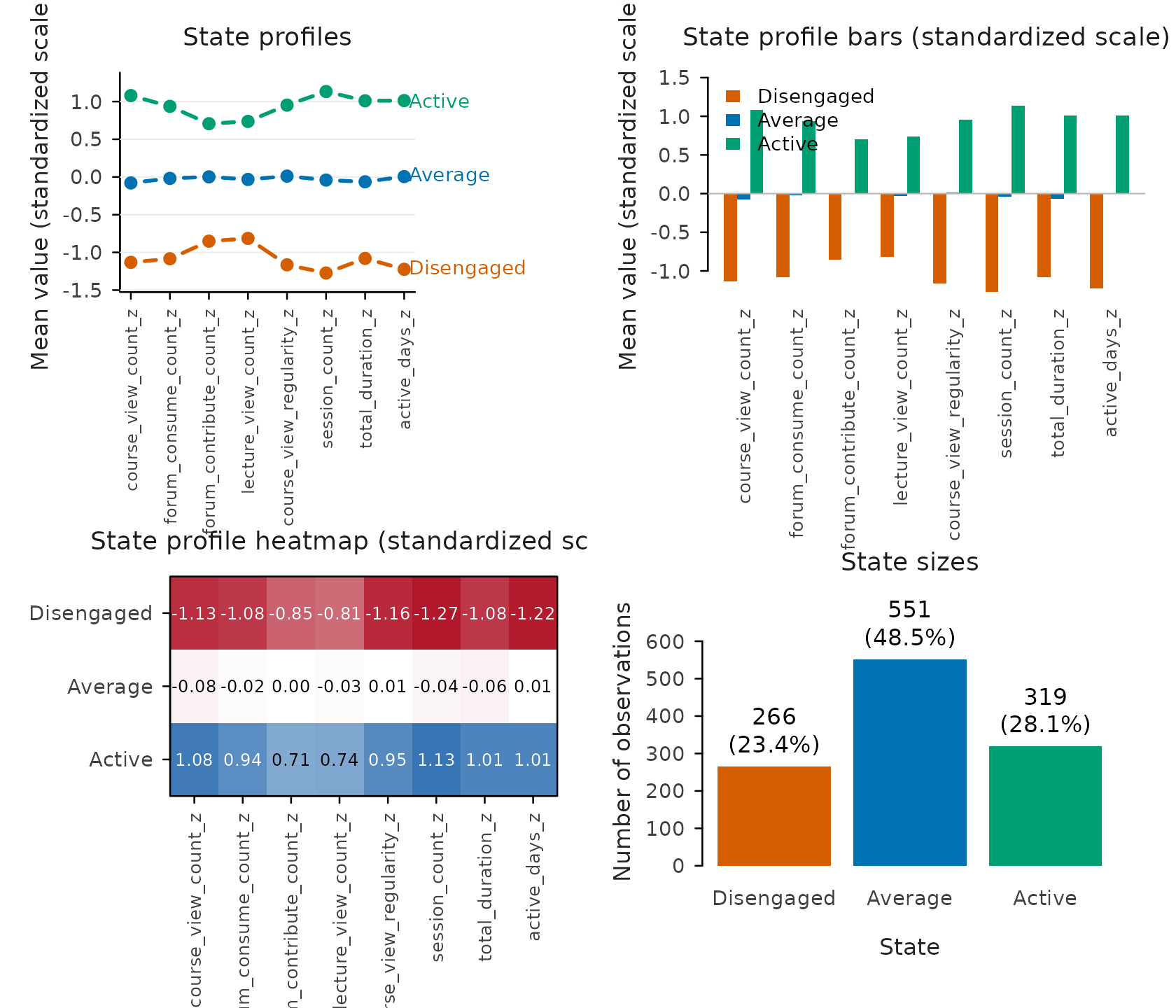
The profile lines answer what makes each state itself: Active sits around one standard deviation above course average on every indicator, Disengaged about one below, Average on the line. Engagement here is a level, not a trade-off between, say, forum and lecture activity, which is exactly what justifies ordered labels. The bars carry the same means but grouped by indicator, which is the view for spotting whether any single indicator breaks the ordering (none does). The heatmap adds the exact magnitudes the lines only sketch: Disengaged is most extreme on session count (−1.27) and least on lecture views (−0.81). The sizes panel grounds prevalence: Average is the plurality (48%), and no state is rare enough to question.
4. Sequences: how states unfold over time
The default sequence view is the heatmap: every aligned sequence as one row, rows ordered by similarity, so persistence shows as long unbroken bands and instability as speckle. It is the one view that keeps all 142 individual journeys visible at once.
plot(fit, which = "sequences")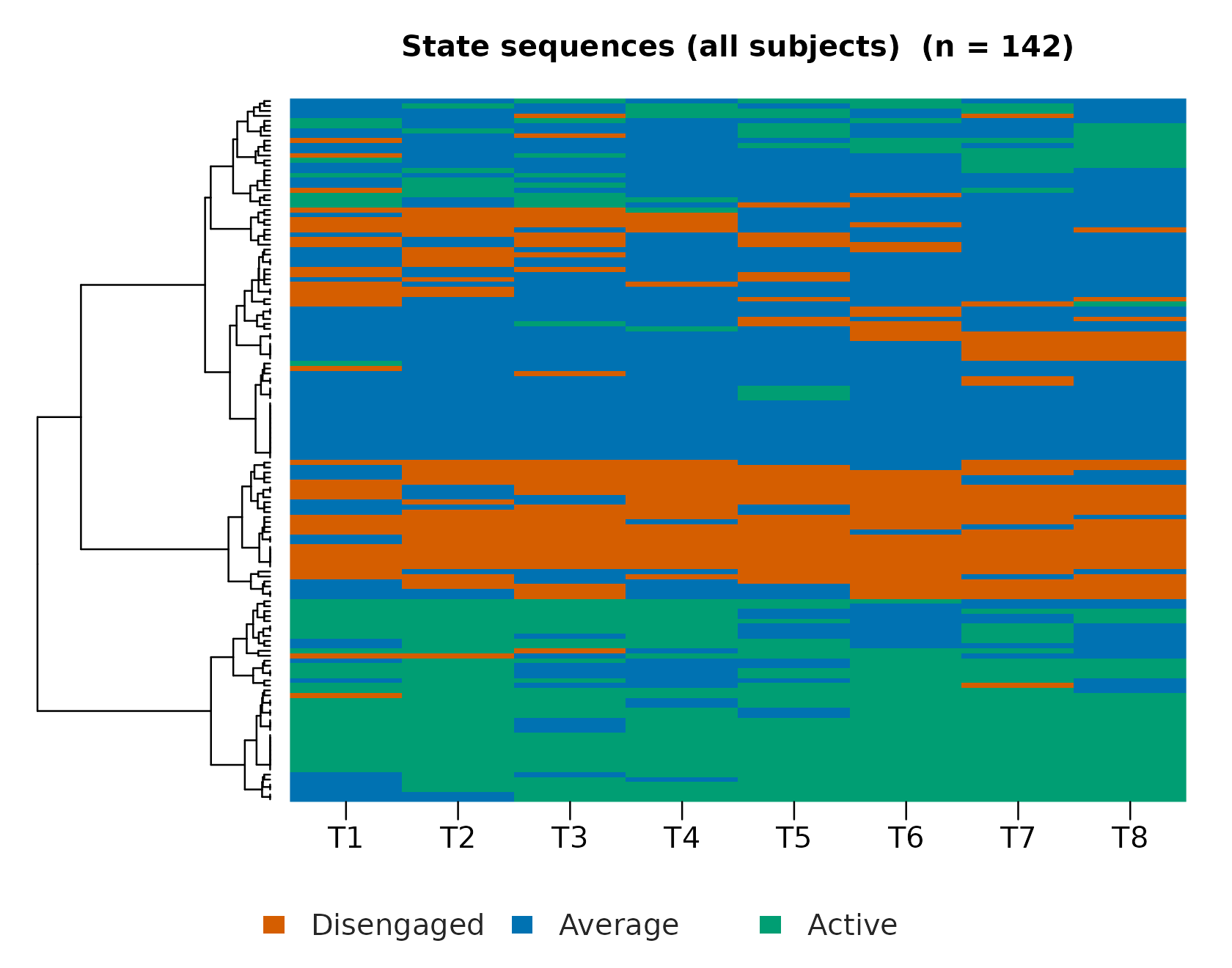
Two further views split the temporal question the heatmap compresses. The distribution answers the aggregate question (does the composition of the cohort drift over the eight positions), while the index plot answers the individual one on a fixed subject order. The distinction matters because a flat distribution can hide heavy individual churn.
plot(fit, which = "sequences", type = "distribution")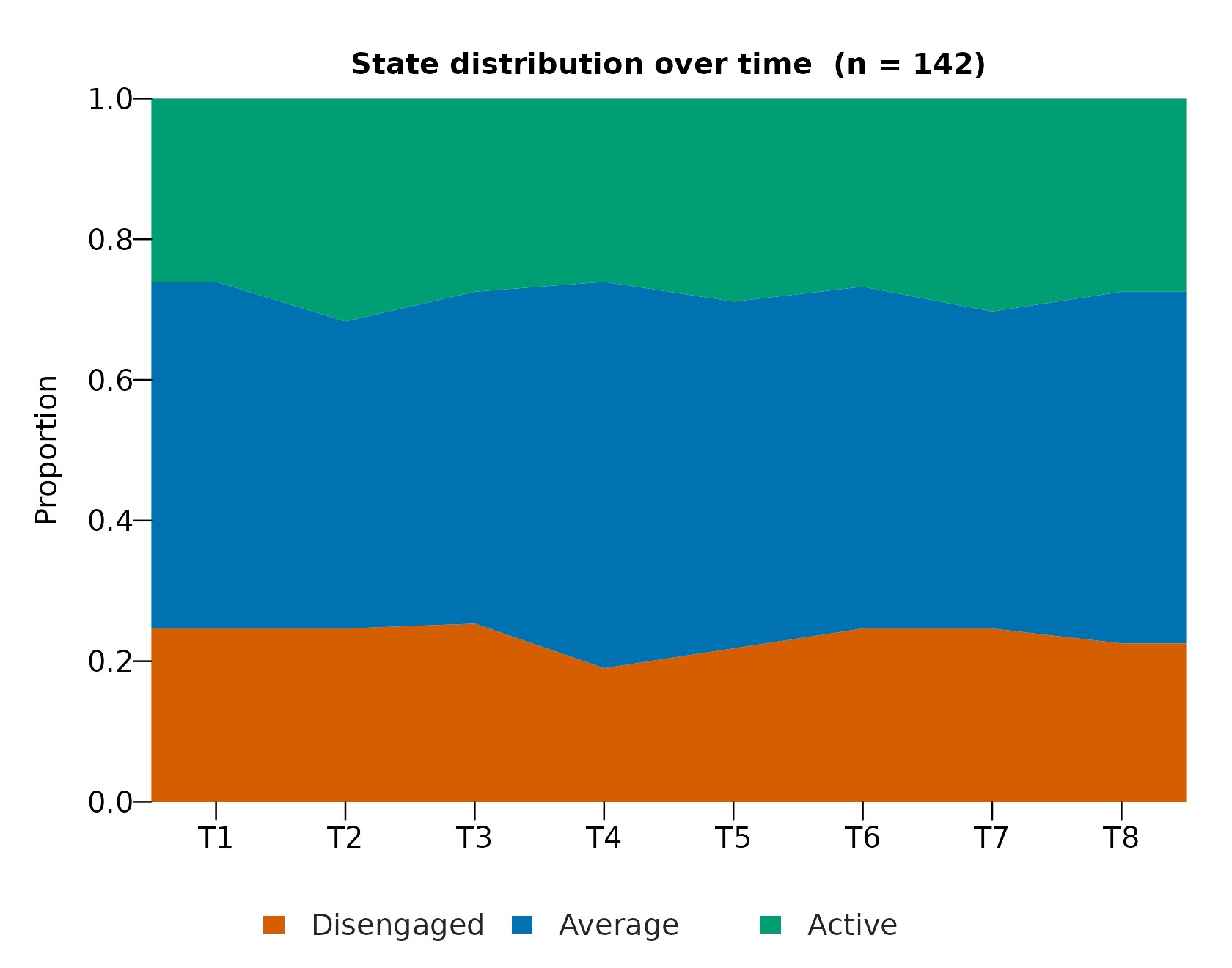
plot(fit, which = "sequences", type = "index")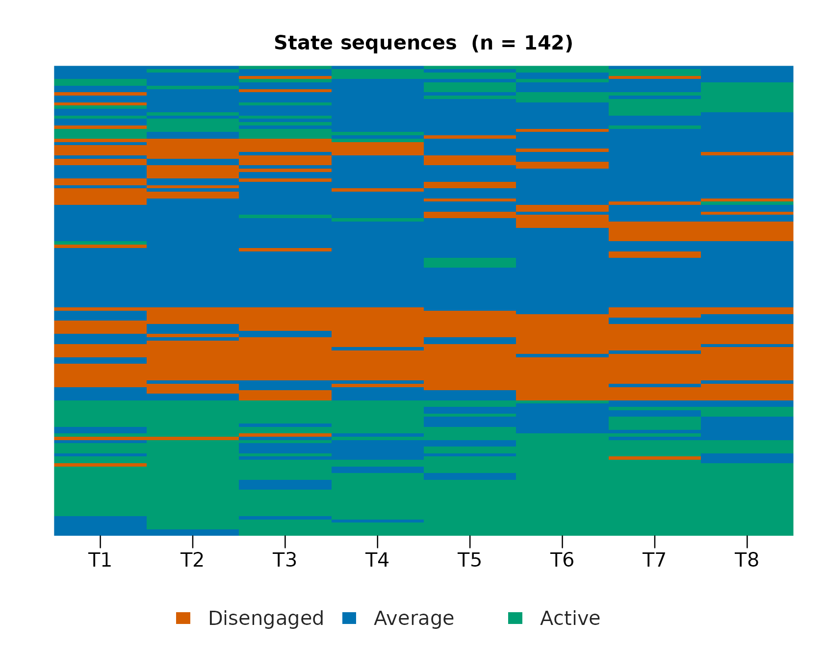
5. Trajectories: groups of similar journeys
Grouping the sequences (LCS distance, Ward linkage) yields three trajectories of 41, 73, and 28 students. The grouped index plot is the core evidence that the groups mean something: one group is dominated by Active rows throughout, one by Disengaged, and the largest mixes Average with excursions. These are visibly different journeys, not arbitrary partitions of similar ones.
plot(fit, type = "index")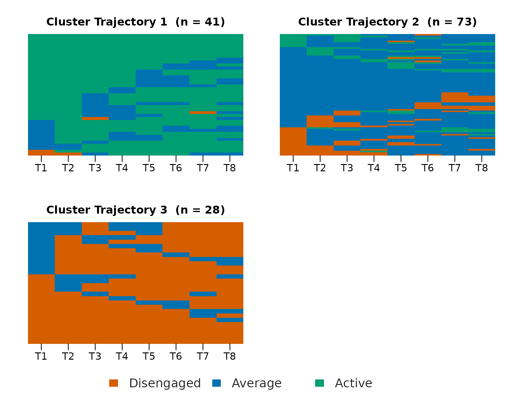
The three groups line up with the three states, so we can name them
now by the state each mostly holds. set_labels() renames in
place: every later table, sequence, and plot follows, and no fitted
value changes.
fit <- set_labels(
  fit,
  trajectories = c("Mostly active", "Mostly average", "Mostly disengaged")
)
plot(fit, type = "distribution")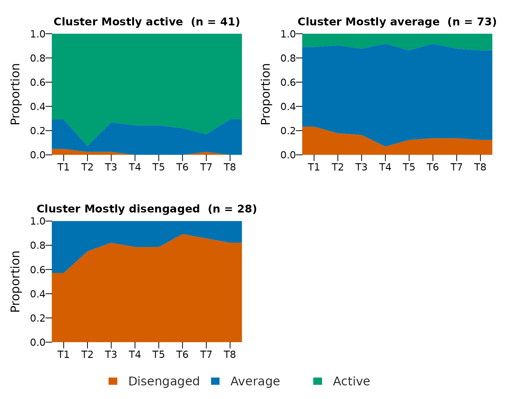
Passing several views in type composes them into one
figure with one row per trajectory and one column per
view, so each group’s transition network sits beside the
sequences it summarises and their changing composition. This is the
standard per-cluster VaSSTra display in one call. A shared legend labels
every panel at once, and the transition column requires the suggested
cograph package.
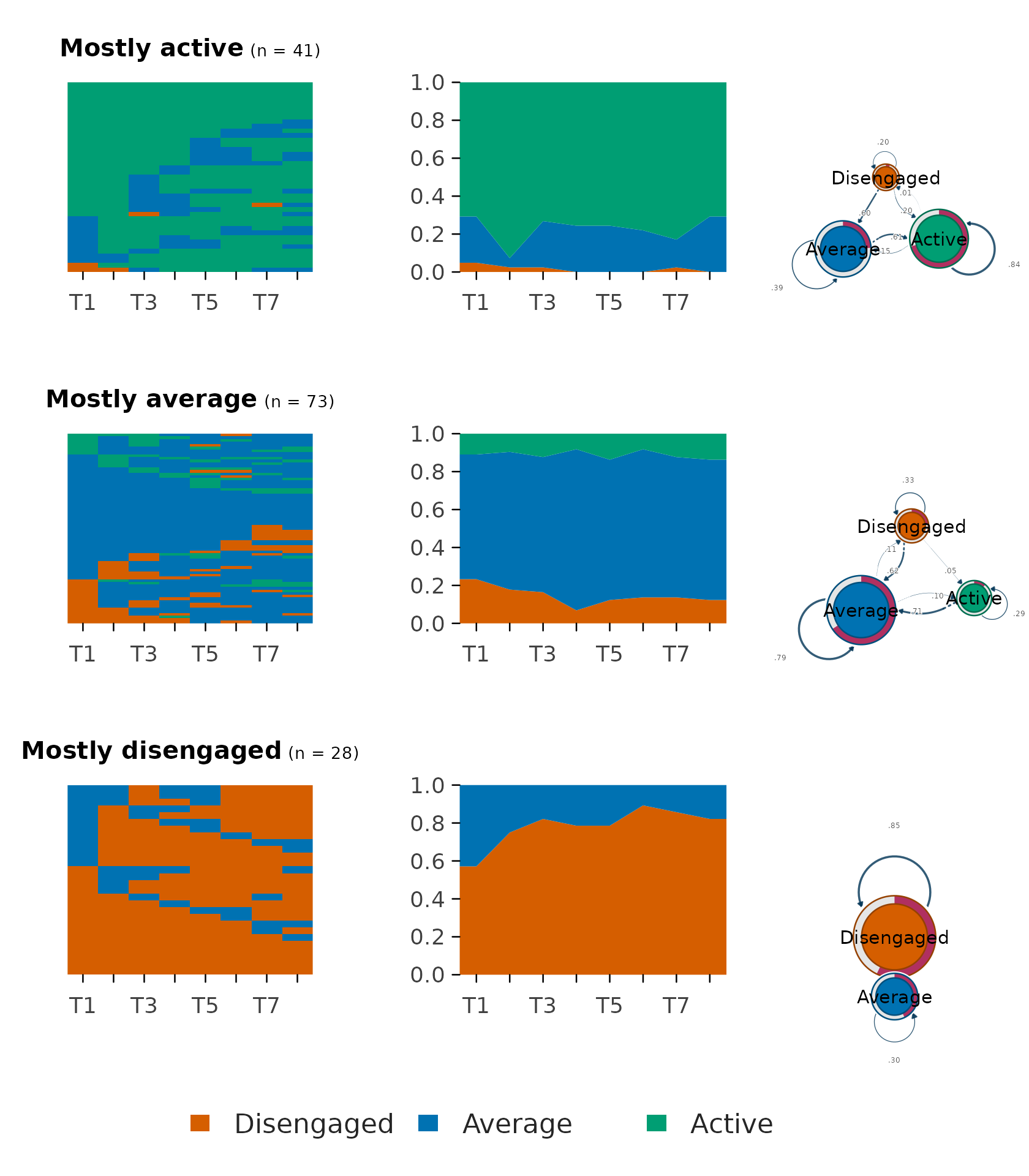
The rows now read as whole stories. The Active group’s network is dominated by the Active self-loop and its distribution stays green, and the Disengaged group mirrors it in red. The mixed middle group shows the busiest network: the many off-diagonal transitions that its higher entropy and mobility counts quantify in the next section.
6. Describing what the trajectories mean
The per-trajectory summary turns those pictures into numbers, one row per trajectory.
as.data.frame(fit, unit = "trajectory")
#>          trajectory  n proportion mean_within_distance n_observed unique_states
#> 1     Mostly active 41  0.2887324             4.258537          8      1.878049
#> 2    Mostly average 73  0.5140845             4.961187          8      1.986301
#> 3 Mostly disengaged 28  0.1971831             3.857143          8      1.821429
#>   transitions   entropy complexity volatility integrative_potential
#> 1    1.829268 0.4189906  0.3251220  0.4436702             0.7696477
#> 2    2.328767 0.4736884  0.3865300  0.4973907             0.1149163
#> 3    1.892857 0.3978570  0.3246998  0.4387755             0.0000000
#>   negative_exposure
#> 1       0.009485095
#> 2       0.131659056
#> 3       0.820436508
The two time-weighted columns exist because
positive_states and negative_states were
declared in the fit: integrative potential is the late-weighted share of
time in Active, negative exposure the same for Disengaged. Here they
separate the groups almost completely (0.77 versus 0.11 versus 0.00 for
integrative potential). Later time points count more, so these indices
read as where the student is heading, which raw state
proportions cannot say. Entropy and transition counts add the stability
dimension: the large middle group is the most mixed in state and also
the most mobile.
Per-student indices for downstream modeling (one row per student with trajectory membership, entropy, complexity, and both exposure indices) come from the same fit:
head(as.data.frame(fit))
#>    user_id        trajectory n_observed unique_states transitions   entropy
#> 1 D2C5F64E     Mostly active          8             3           3 0.9850568
#> 2 D7E3D0DC     Mostly active          8             3           4 0.8194484
#> 3 2926CF64 Mostly disengaged          8             1           0 0.0000000
#> 4 985AFF35 Mostly disengaged          8             2           2 0.6021808
#> 5 F89100C7     Mostly active          8             3           4 0.8868595
#> 6 AB944042 Mostly disengaged          8             2           2 0.3429510
#>   complexity volatility integrative_potential negative_exposure
#> 1  0.6497440  0.7142857             0.4166667        0.08333333
#> 2  0.6842925  0.7857143             0.5833333        0.08333333
#> 3  0.0000000  0.1666667             0.0000000        1.00000000
#> 4  0.4147911  0.4761905             0.0000000        0.55555556
#> 5  0.7118826  0.7857143             0.3888889        0.19444444
#> 6  0.3130271  0.4761905             0.0000000        0.88888889
7. Relabeling without refitting
Interpretation happens after fitting, so labels stay
assignable at any point without refitting, which is exactly what Section
5 did once the groups were visible. set_labels() renames in
place, propagating the names through every table, sequence, and plot,
including the recorded positive and negative states, and changing no
fitted value. A full vector renames every group; a named vector renames
only what it names, which is handy for refining a single label after a
closer look:
# rename only one group, by name
fit <- set_labels(fit, trajectories = c("Mostly average" = "Fluctuating"))
The named trajectories now flow through every summary of the fit:
summary(fit)
#>          trajectory  n proportion mean_within_distance n_observed unique_states
#> 1     Mostly active 41  0.2887324             4.258537          8      1.878049
#> 2    Mostly average 73  0.5140845             4.961187          8      1.986301
#> 3 Mostly disengaged 28  0.1971831             3.857143          8      1.821429
#>   transitions   entropy complexity volatility integrative_potential
#> 1    1.829268 0.4189906  0.3251220  0.4436702             0.7696477
#> 2    2.328767 0.4736884  0.3865300  0.4973907             0.1149163
#> 3    1.892857 0.3978570  0.3246998  0.4387755             0.0000000
#>   negative_exposure
#> 1       0.009485095
#> 2       0.131659056
#> 3       0.820436508
8. Full control: explicit steps and grid comparisons
Everything above is also four explicit steps, each with the same
automated defaults. This is the route to take when intermediate objects
are needed, when states come from another method (enter at
step2_sequences() with a state column), or when the method
itself is under comparison:
states <- step1_states(engagement, n_states = 3)
sequences <- step2_sequences(states)
trajectories <- step3_trajectories(sequences, dissimilarity = "lcs",
                                   method = "ward.D2")
description <- step4_describe(trajectories, positive_states = "Active",
                              negative_states = "Disengaged")
When the clustering method is itself in question,
state_choices() and trajectory_choices() fit
the full grid and return one tidy row per candidate. Nothing is selected
silently. Recommendations are marked within each method (silhouette for
hard clustering, BIC for LPA, since model-based criteria only compare
within LPA), and the inspected candidate is fitted with
fit_state_choice():
state_options <- state_choices(engagement, n_states = 2:4,
                               method = c("lpa", "kmeans"))
state_options
#> VaSSTra state choices
#>   6 candidates | 6 successful | 2 recommended
#>  candidate_id n_states method lpa_model recommendation_criterion silhouette
#>             3        4    lpa       EEI                      bic  0.2028840
#>             4        2 kmeans      <NA>               silhouette  0.3519794
#>       bic min_size eligible
#>  19362.25      152     TRUE
#>        NA      519     TRUE
plot(state_options, metric = "silhouette")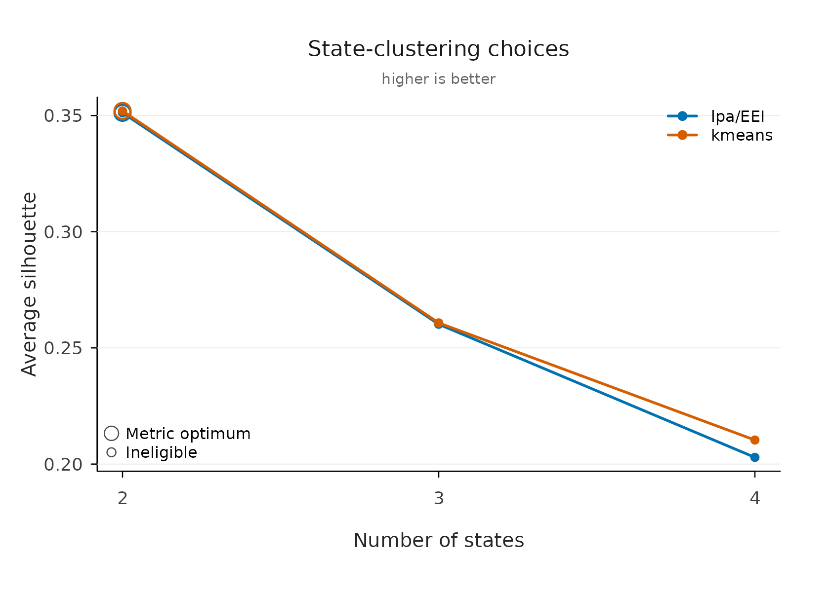
states <- fit_state_choice(state_options, n_states = 3, method = "lpa",
                           labels = c("Disengaged", "Average", "Active"))
The choice plot and evaluate() show the same silhouette
on the same scale, so the method comparison here and the count
comparison there compose into one argument. Method overview and formal
background: the VaSSTra
chapter.