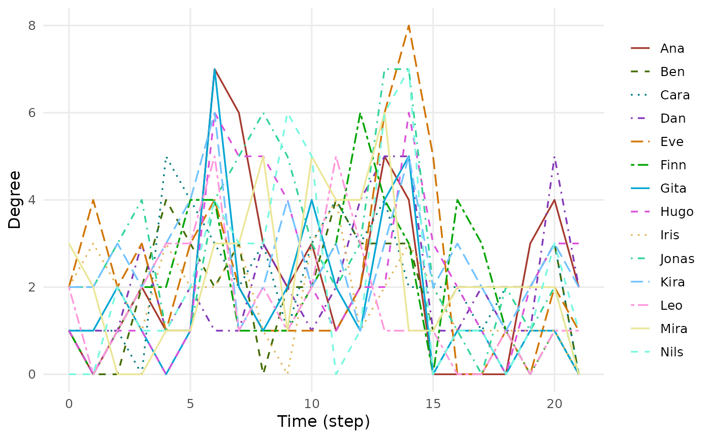
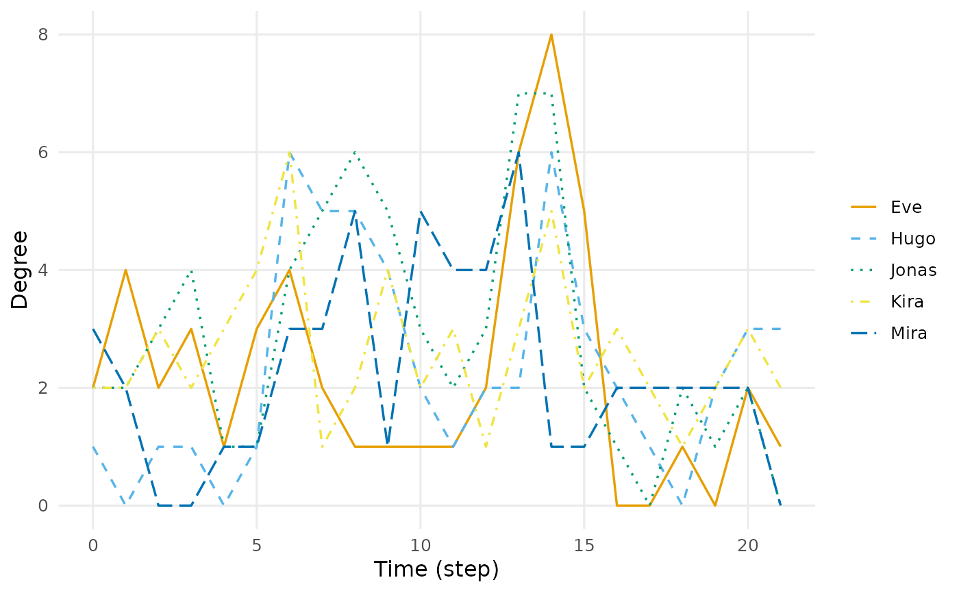
Draws the quantity against time. Node-level measures are drawn as one line per vertex; graph-level measures as one line per measure. Distinctions are carried by colour and line type together, never by colour alone.
Arguments
- x
A
dynet_metric.- type
"line"for trajectories over time,"heatmap"for a vertex-by-time tile plot,"ridge"for small multiples per measure. Ignored for a measure with no time axis.- highlight
Optional character vector naming the series to draw in colour, with everything else in grey: vertex names for a node-level measure, measure names for a graph-level one. For a
mixing()result a group name selects every flow into or out of that group, sohighlight = "Teacher"colours the teacher rows and columns of the mixing table. A name that matches nothing raises an error of classdynet_unknown_highlight. Ignored for a measure with no time axis.- top
How many rows to draw. For a measure taken over time, the
topvertices with the largest mean value;NULL, the default, draws every vertex. For a measure with no time axis, thetoprows with the largest absolute value, defaulting to30, with a subtitle naming how many of how many are shown.- palette
Colours for the series:
"okabe"(the default),"extended","many", your own vector of colours, or a function ofn.- base_size
Base font size.
- ...
Ignored.
Value
A ggplot object. Drawing happens when that object is printed, so
the plot is the return value here rather than a side effect.
Details
A measure with no time axis, such as reachability or durations(), has no
trajectory to draw and is shown as a bar panel instead, one bar per vertex
or pair and one facet per measure. type and highlight have nothing to
act on there and are ignored.
Examples
dn <- dynet(school_contacts)
degree <- centrality_series(dn, measure = "degree")
plot(degree, top = 5)
 plot(degree, palette = "extended")